Layout
When we redesigned our website, we created responsive page layouts, which means our website can be viewed on all devices and in all dimensions, including mobile.
The following dimensions are for a site being viewed on a desktop with a resolution of 1680 x 1050.
Home Page
Logo
Dimensions: 486px x 65.33px
Main Navigation

Menu dimensions: 1489.33px x 48px when viewed on desktop browser with resolution of 1680 x 1050. Menu width will shrink and expand to fit the browser and will be hidden when viewed on mobile devices.
Main Navigation Items

Dimensions: 182.667px x 32px
I want to... Buttons

Dimensions: 376.854px x 178.67px
This button spans 2 rows and is positioned to the left of the other, smaller buttons.

Dimensions: 366.854px x 81.33px
There are 4 buttons this size, and they are positioned in a 2x2 grid.
I am a... Buttons

Dimensions: 546px x 162.896px
There are 2 buttons this size, and they are positioned above the rest of the buttons.

Dimensions: 357.313px x 106.604px
There are 6 buttons this size, and they are in a 3x2 grid placed below the 2 bigger buttons.
Request Information
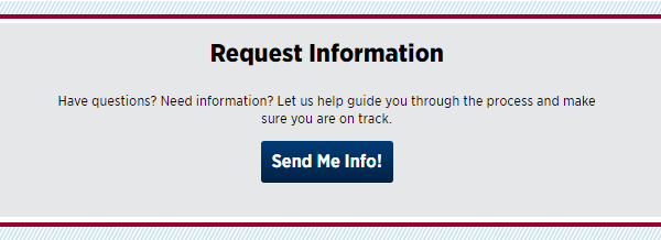
background-color: #e6e7e9;
text-align: center;
box-sizing: border-box;
Request Information is an h2 with
font-size: 1.8rem;
font-weight: 800;
margin-bottom: 1rem;
Paragraph text
font-size: 1rem;
font-weight: 400;
Send Me Info! button
Dimensions: 160px x 50px
font-size: 1.3rem;
display: block;
font-weight: 700;
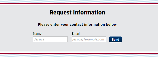
Please enter your contact information below is an h2 with
font-size: 1.2rem;
font-weight: 700;
Form labels Name and Email
font-size: 16px;
text-align: left;
margin-bottom: 0.25rem;
Form Input fields
Dimensions: 168px x 20px;
padding: 3px;
Placeholder text
font-size: 16px;
Send button
Dimensions: 61.875px x 30px
font-size: 16px;
font-weight: bold;
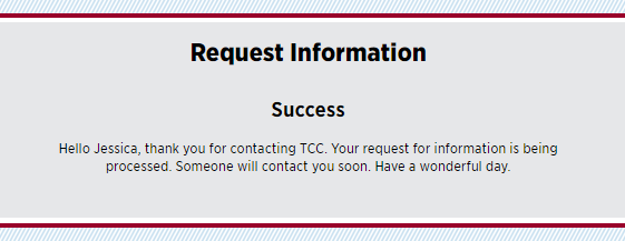
Success is an h2 with
font-size: 24px;
font-weight: bold;
Paragraph text
font-size: 16px;
Feed Headings
Both feed headers use an h2 heading with
font-size: 48px;
font-weight: 800;
Feed Text
text-decoration: none;
font-size: 16px;
Calendar of Events
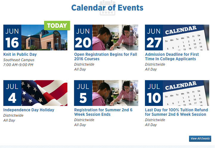
Dimensions: 1280px x 880px
This container displays 6 items at a time in a 3x2 grid. Each item links you to the specific calendar event page that contains more detailed information.
Event Items
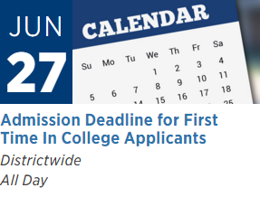
Dimensions: 382.396px x 290px
View All Events Button

Dimensions: 133.583px x 38px
background-color: #2c74ae;
General Announcements

Dimensions: 1280px x 543.938px
This container displays 3 items positioned on 1 row. Each item links you to the specific page that has more detailed information on the general announcement.
Announcement Items

Dimensions: Width is 382.396px. The height will shrink and expand to fit the announcement description. In this announcement's case, the height is 254.604px.
Read All General Announcements Button

Dimensions: 267.188px x 38px
background-color: #2c74ae;
District Announcements
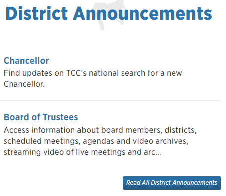
Dimensions: 600px x 536.66px
This container displays announcements in a column, and each announcement links to a specific page with more detailed information on the District announcement.
Announcement Items

Dimensions: 560px x 110.333px
Read All District Announcements Button

Dimensions: 263.5px x 38px
background-color: #2c74ae;
TCC News

Dimensions: 600px x 826.667px
This container displays news releases in a column, and each links to a specific page with the full article. The height of this column will shrink and expand to fit the contents of the feed items.
News Items

Dimensions: 560px x 166.334px
Read More TCC News Button

Dimensions: 176.667px x 38px
background-color: #2c74ae;
Reach Magazine
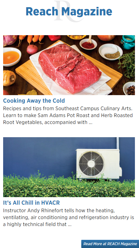
Dimensions: 640px x 1112.33px
Magazine Items
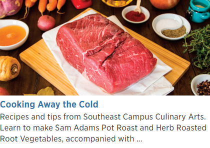
Dimensions: 560px x 393.667px
Read More at Reach Magazine Button

Dimensions: 248.813px x 38px
background-color: #2c74ae;
Videos

Dimension: 600px x 646.667px
Video Description is an h3 heading with
font-size: 24px;
font-weight: 400;
Video Item

Dimensions: 600px x 341.333px
The thumbnail for the video links to video's page on YouTube.
Section and Hub Pages
All section and hub pages are built using the same template. Here is an example of one of these pages: Admission
Section Front Header and h1

Dimensions are 1280 x 118 and font size is 5rem when viewed full screen on a desktop view. These dimensions change when viewed in different resolutions on different devices and platforms.
Tile

Dimensions are 386 x 356 and the tile title is an h2. These tiles expand and shrink to fit the largest tile on the row. Each row fits a maximum of 3 tiles.
The green bar on each tile is a 12px solid #8dc63f and uses the border-left element.
Learn More Button

Dimensions: 100.5px x 34px;
font-size: 16px;
Detail Page
All detail pages are built using the same template. Here is an example of 1 of these pages: How to Apply for Admission
Detail Page Header and h1
How to Apply for Admission
font-size: 2em;
font-weight: 800;
color: #0c2753;
text-transform: uppercase;
Main content section

Width: 1038.67px;
Height will expand to fit the content on the page
Footer
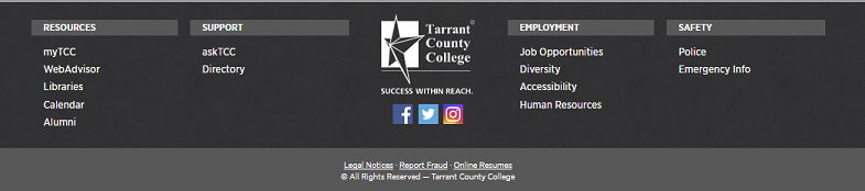
The footer's width extends to 100% of the page
Column headers are h5 headings with
font-size: 14.4px;
font-weight: 700;
color: #fff;
background-color: #585858;
text-transform: uppercase;
Footer Links
font-size: 16px;
color: #fff;
list-style-type: none;
Footer Logos
Dimensions: 150px x 130.667px
Dimensions: 32px x 32px
Footer Legal
background-color: #585858;
color: #fff;
font-size: 12.8px;
font-weight: 100;
Side Navigation
The side navigation appears on all detail pages, and it's intended purpose is to help the user navigate the detailed sub-pages of each section.
Side navigation for How to Apply for Admission
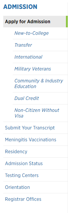
Dimensions: 218px x 681px
Navigation Top Header

font-size: 20.8px;
font-weight: 800;
text-transform: uppercase;
color: #315cbf;
Navigation Current Page

font-size: 16px;
font-weight: 700;
background-color: #e9e9e9;
border-right: #8dc63f;
color: #000;
padding: 10px 6px;
Sibling and Parent Pages

font-size: 16px;
font-weight: 400;
border-bottom: 1px solid #e9e9e9;
color: #315cbf;
padding: 10px 6px;
Children Pages

font-size: 16px;
font-weight: 300;
font-style: italic;
bolder-bottom: 1px solid #e9e9e9;
color: #315cbf;
padding: 10px 6px;
Updated May 12, 2025